Storyboarding is something that every website designer has to focus on during the initial stages of development. To put it in simpler terms, storyboarding refers to how a web page design should look, feel, and interact with the user. Both the web design and development teams need to be part of this stage to streamline the design and development process of a website.
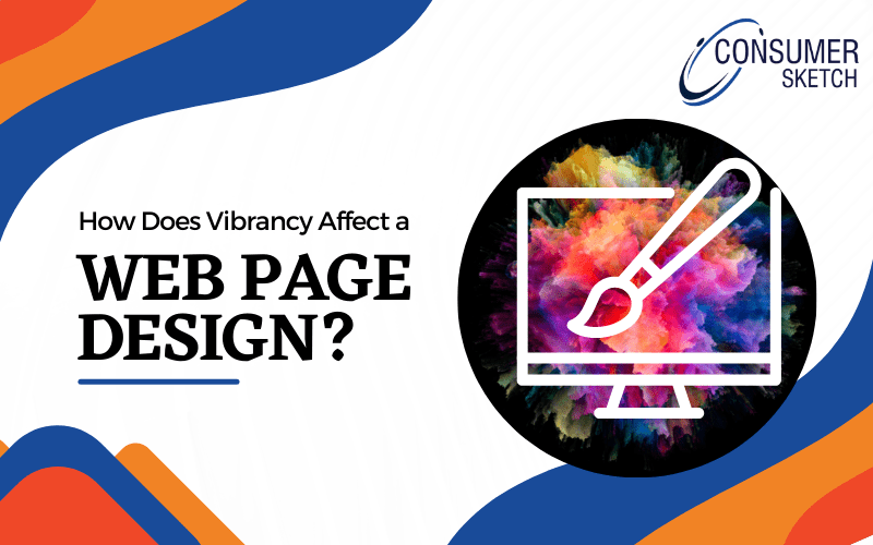
Creating a Vibrant Web Page Design
Storyboarding is also important because no matter what you try to achieve with your website, whether you are selling, promoting, sharing, or even educating someone. At the end of the day, the web designer needs to be clear about how they will capture the user’s attention and then retain it.
Why using vibrant colors on your web page design is important
Recently almost all the websites on the internet have been using vibrant colors on their pages to attract customers and keep their attention.
In addition to this, recent studies have shown over 85% of customers first focus on the website colors and then decide if they should purchase from the website.
Other than this, over 80% of the customers associate their favourite brand with a color similar to how Coca-Cola is associated with red colour.
What is color theory?
How colors on the web page should interact with each other through vibrancy, contrast, and complementation, as well as how the user will respond to them, is often referred to as a color theory. Colors’ vibrancy affects a web page design and makes it more appealing.
What is color complementation?
In the real world, we often see colors in proximity to each other rather than being isolated. According to studies, this is because colors form different kinds of relationships with each other.
The same studies have also shown that colors that are on the opposite sides of the spectrum will look more appealing. Other than this, colors on opposite sides of the spectrum will complement each other and retain the viewer’s attention.
Also Read:
What is contrast web page design?
Now you have gotten a basic understanding of color complementation. Let’s take a look at what color contrast is.
Color contrast allows the viewer to look at an object or, in our case, a web page without tiring their eyes out. Contrast also helps with reducing eyestrain, as well as helps with focusing attention.
In some areas, such as a web page, color contrast is essential for sections that have text. To put it in simpler terms by giving you an example, you cannot write something in black over a gray background. This will put too much strain on the reader’s eyes, cause irritation and reduce focus.
However, when used correctly, contrast can also “highlight” important things on your website and retain the viewer’s focus.
If you are a web designer who is in doubt about what color you should use, then having a very light background with a very dark color will give you proper focus on important things on your website. A web design company will often hire designers who are good with color contrast.
What is vibrant web page design?
Vibrancy is something that dictates the emotions of a web page. By using brighter colors, you can make the user feel more energetic as well as active.
On the other hand, using darker colors will make the user feel more relaxed and stimulate their critical thinking.
Let’s understand it with the help of an example: If you have recently visited news or tabloid websites, you must have noticed that those websites are using darker colors on their blog pages.
This helps them make their visitors feel calm and more relaxed. Hence, it’s easier for them to keep their attention and keep reading.
On the other hand, if you visit a gaming website, you will notice that most of the colors are bright, which makes the user feel more energetic and excited about the product. This is how vibrancy affects a web page.
Before ending the blog, let’s take a look at the meaning of colors and how you can use them on your webpage: –
- Red: vibrant, power, flair
- Orange: Warm, fun, energy, less aggressive
- Yellow: warmth, caring, sunny, safe
- Blue: professional, space, refreshing, trust
- Green: health, youth, nature
- Black: Strength, luxury, death
- White: innocent, pure, clean
Conclusion
Whether you are a freelance web designer or a web design company in Vadodara, while designing a web page, you need to be careful about how you will use colors to your advantage and be aware of how they will make your reader feel.
If you want to read the latest trending news for technology, subscribe to Senonches website today.